skip to main |
skip to sidebar
Back scratches, air conditioning, and "Unsolved Mysteries"
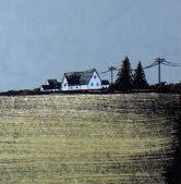
To the left is the completed ink drawing for a poster and art print that I'm printing this week. In a series of emails with fellow ink artist Erica Williams, we were discussing the use of texture and density as a means of conveying value and depth in ink work. This is something my sometimes flat architecture-based compositions seem to lack. I think this is most effectively done when drawing more organic forms in ink (like skulls, plant life, animals with fur or scales, etc.) and is more difficult to apply to geometric forms. I've been trying to explore ways in which I can add more texture (and thus depth) to architectural structures, both in the original line drawings and on the films for other colors in the final screen printed version. It wasn't very difficult to get some bit of depth with the rubble on either side of the structure, as the rubble is basically a big organic form comprised of smaller geometric forms. I'm banking on color and texture use on the other screens to give life to the more flat areas in the structure. I've got a few tricks up my sleeve for this one, and I'm hoping they pan out.
Check out Erica's stuff. She's rad.
Speaking of things you should check out, my friends at Sonnenzimmer are in the process of raising money via Kickstarter to make what I'm sure will be an outstanding book entitled Warp and Weft. Check it.

No comments:
Post a Comment