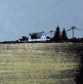
I was asked to participate in a print event called "Picasso Versus Matisse", which was curated by fellow artist Alan Campbell. Each of us was asked to reference the work of Picasso or Matisse in some way. This was something I'd never personally done before, so I would have been unsure where to start, had Alan not suggested Matisse's 1912 painting "The Danse With Nasturtiums". My idea was to focus on the room, removing the dancing figures. This was fun to work on, and I'm glad Mr. Campbell asked me to be a part of this. This print is available through my site right now, and it's a really small edition.
Also, my multi-talented friend Gina Kelly has recently helped produce a collaborative musical animated film entitled Quick and Dirty: A Total Exquisite Corpse Animation. This film features a variety of excellent artists, including (but not limited to) Dan Grzeca, Guy Burwell, Kathleen Judge, and many more. The filmmakers are trying to get this movie out there to be seen by the mases, into art museums, and submitted to film festivals. Naturally, all of this costs money, so check out the trailer and read more about the project here. You can back this project at many levels via Kickstarter, some for even less than what you'd pay for a copy of a movie (and you'll get a copy!). Check it out.
Lastly, I'm heading out of town this morning for a few days with my band. I'm waiting for our guitar player Jason to pick me up with the van and we're off to Columbus, OH this evening for a show. Then we're heading to North Carolina to play Death To False Hope Fest in Durham, which will be followed by a marathon drive back home (unless we can find a last minute opening on a show somewhere in between the South and Chicago!). I've got to get started on some prints (got some crazy art prints in the works) and various illustration stuff, finishing as much as I can before Flatstock 35 in Chicago in less than three weeks. Boy, it sure gets here fast! Nevertheless, expect a bunch of new prints to be available on my site early next week.
28 June 2012
11 June 2012
Back scratches, air conditioning, and "Unsolved Mysteries"
To the left is the completed ink drawing for a poster and art print that I'm printing this week. In a series of emails with fellow ink artist Erica Williams, we were discussing the use of texture and density as a means of conveying value and depth in ink work. This is something my sometimes flat architecture-based compositions seem to lack. I think this is most effectively done when drawing more organic forms in ink (like skulls, plant life, animals with fur or scales, etc.) and is more difficult to apply to geometric forms. I've been trying to explore ways in which I can add more texture (and thus depth) to architectural structures, both in the original line drawings and on the films for other colors in the final screen printed version. It wasn't very difficult to get some bit of depth with the rubble on either side of the structure, as the rubble is basically a big organic form comprised of smaller geometric forms. I'm banking on color and texture use on the other screens to give life to the more flat areas in the structure. I've got a few tricks up my sleeve for this one, and I'm hoping they pan out.
Check out Erica's stuff. She's rad.
Speaking of things you should check out, my friends at Sonnenzimmer are in the process of raising money via Kickstarter to make what I'm sure will be an outstanding book entitled Warp and Weft. Check it.
Check out Erica's stuff. She's rad.
Speaking of things you should check out, my friends at Sonnenzimmer are in the process of raising money via Kickstarter to make what I'm sure will be an outstanding book entitled Warp and Weft. Check it.
Subscribe to:
Comments (Atom)


